GRAPHIC BRAND
The previous graphic branding was many years old, and they have finally decided to change the entire visual identity.
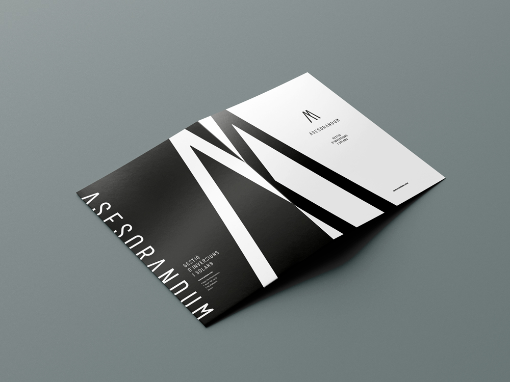
We keep the naming, for its power: "Asesor" is what they offer to the client; "andum" is the suffix, of Latin origin, which adds grandeur to the word. We use the Barlow Condensed font for its easy readability and character, as it is widely used in the industrial and financial sectors. We remove the "A" to bring modernity and a sense of growth, like an arrow pointing upwards.
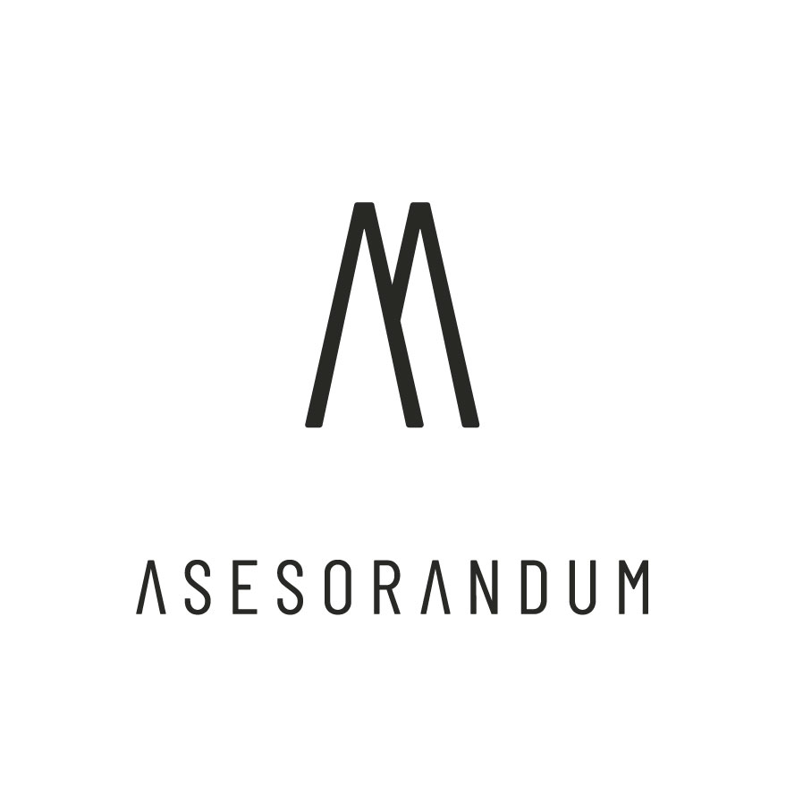
We create the pictogram with the two initials 'Asesor' + 'Andum' (A+A). By overlapping and hollowing them out, we turn them into an 'M,' the last letter of the naming.
For the color , we choose a very dark gray or 'ink black' (not enriched black): classic and elegant, while also providing neutrality, size, sobriety, security, and luxury.
—
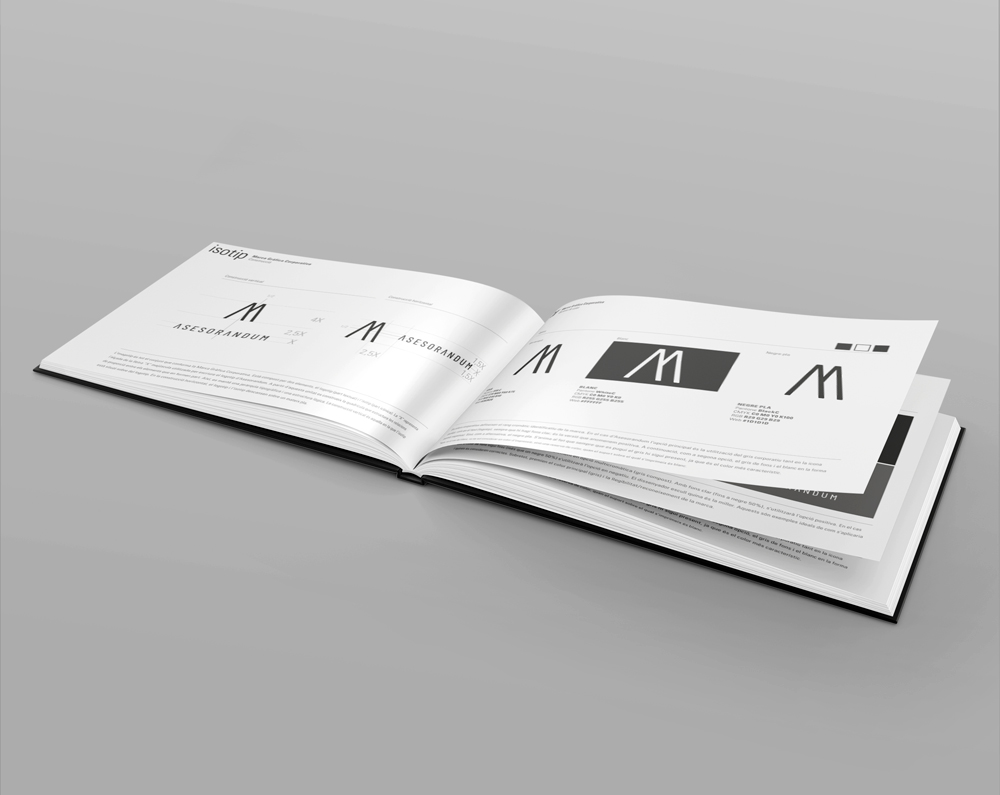
BRAND GUIDELINES
The Brand Guidelines is the document in which we visually describe everything essential for using Asesorandum's corporate graphic brand: logo, image, icon, typography, colors, proportions, and their application rules.
—
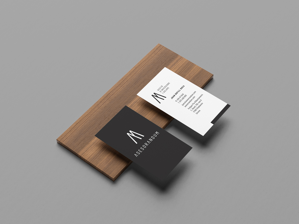
CARD
We symbolize growth (investments) by designing the name card vertically, with a classic-contemporary style. One part remains for all the partners, and the other contains personal information. We finish it with a soft-touch matte lamination and 3D UV that reflects light and adds volume to the whole.
—
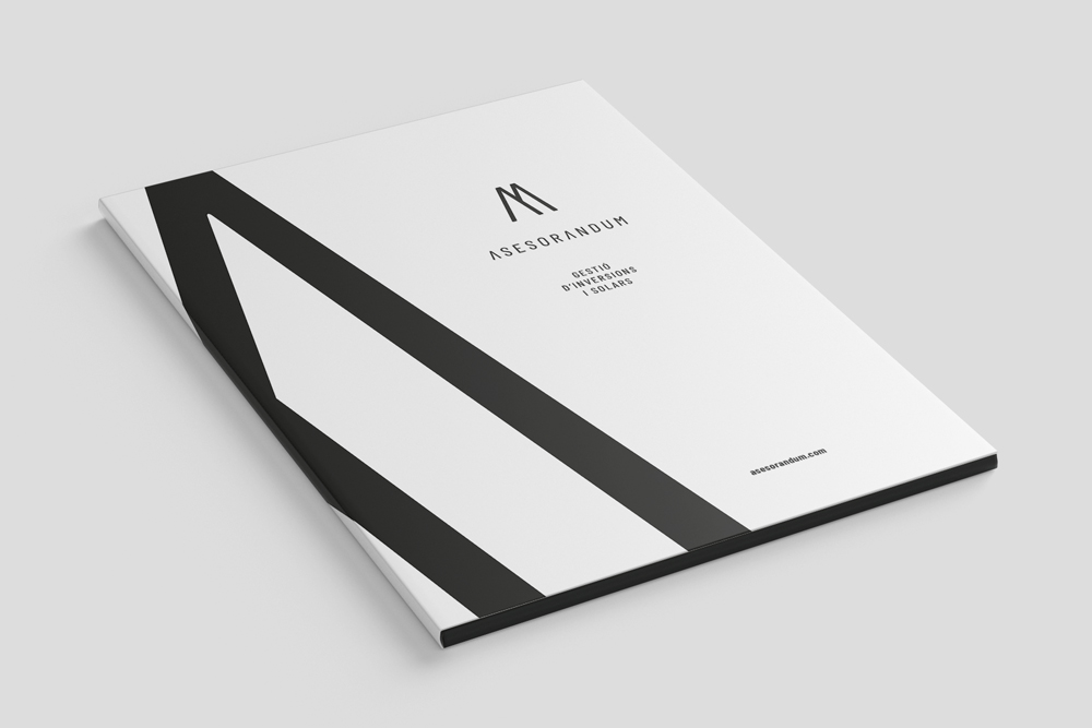
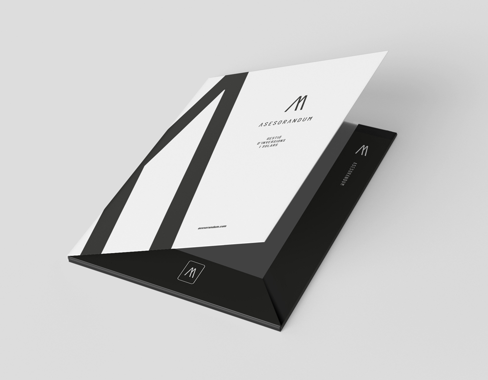
FOLDER
The folder also maintains the classic-contemporary style, with a combination of white on the exterior (front and back cover) and black on the interior (tabs). The giant pictogram (M) allows us to create continuity, impact, and a reading path. We place all the data on the outer part and add minimal information on the inside, in contrast to the white papers that will be stored there. We also include perforations for inserting the corporate card.
—
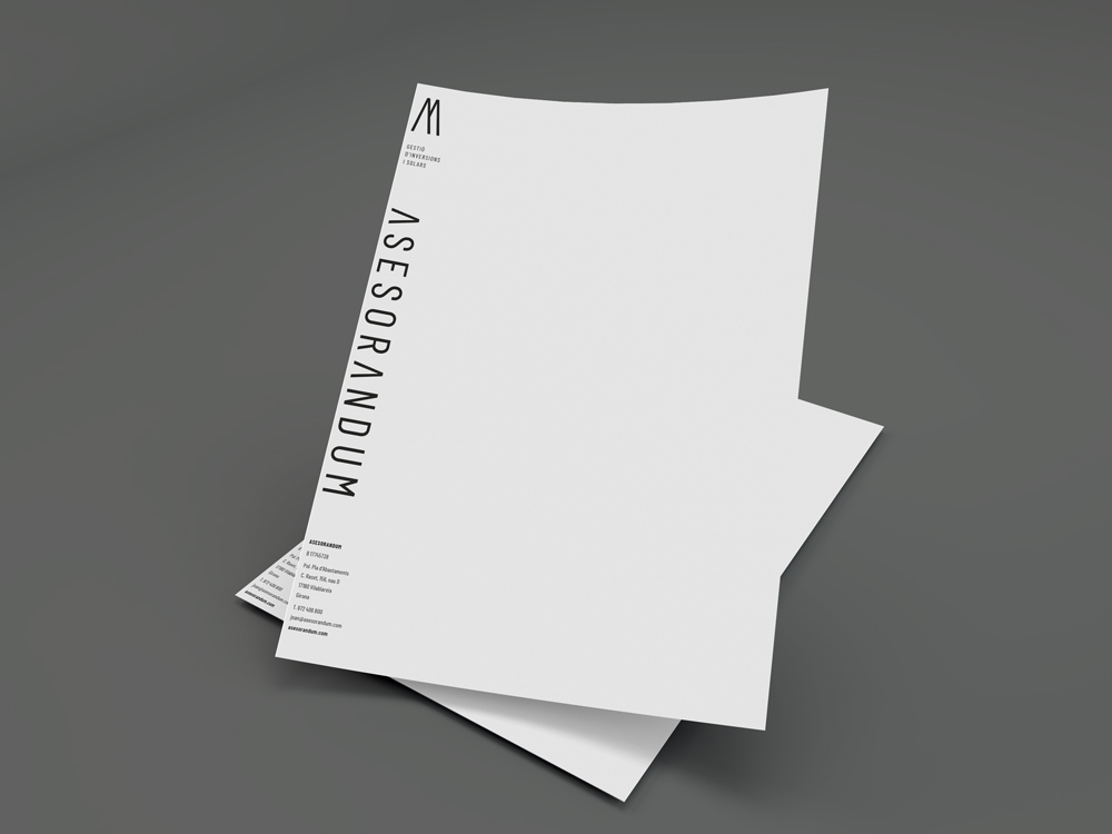
A4
For stationery, we respect the sleek and high-end style of the entire brand identity. We place the pictogram (M) on the left side and a prominent ASESORANDUM at the top, with all the details at the bottom. The reason for aligning all the content to the left is to maximize the use of the paper surface. We pre-print it to make it easier and more cost-effective for the customer, as they only need to print their content afterward.