CORPORATE BRANDING
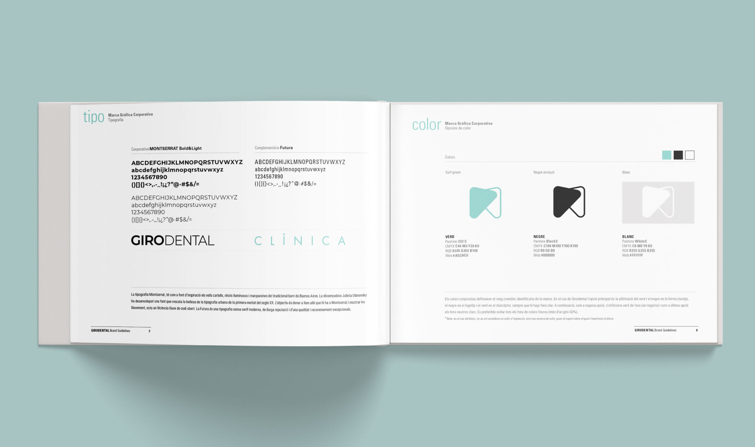
Therefore, the graphic mark had to be able to convey the values of this phrase in a simple and elegant visual expression. The logo as a whole represents the interaction and intervention between the clinic and oral health. On one hand, you can observe the tooth itself, represented by color, and on the other hand, the shape of the tooth, its profile. The typography used is minimalist; the goal was to express the maximum with minimal detail: the thinness of the lines and the clarity of the colors allow for the identification of a modern and professional clinic.
![]()
BRAND GUIDELINES
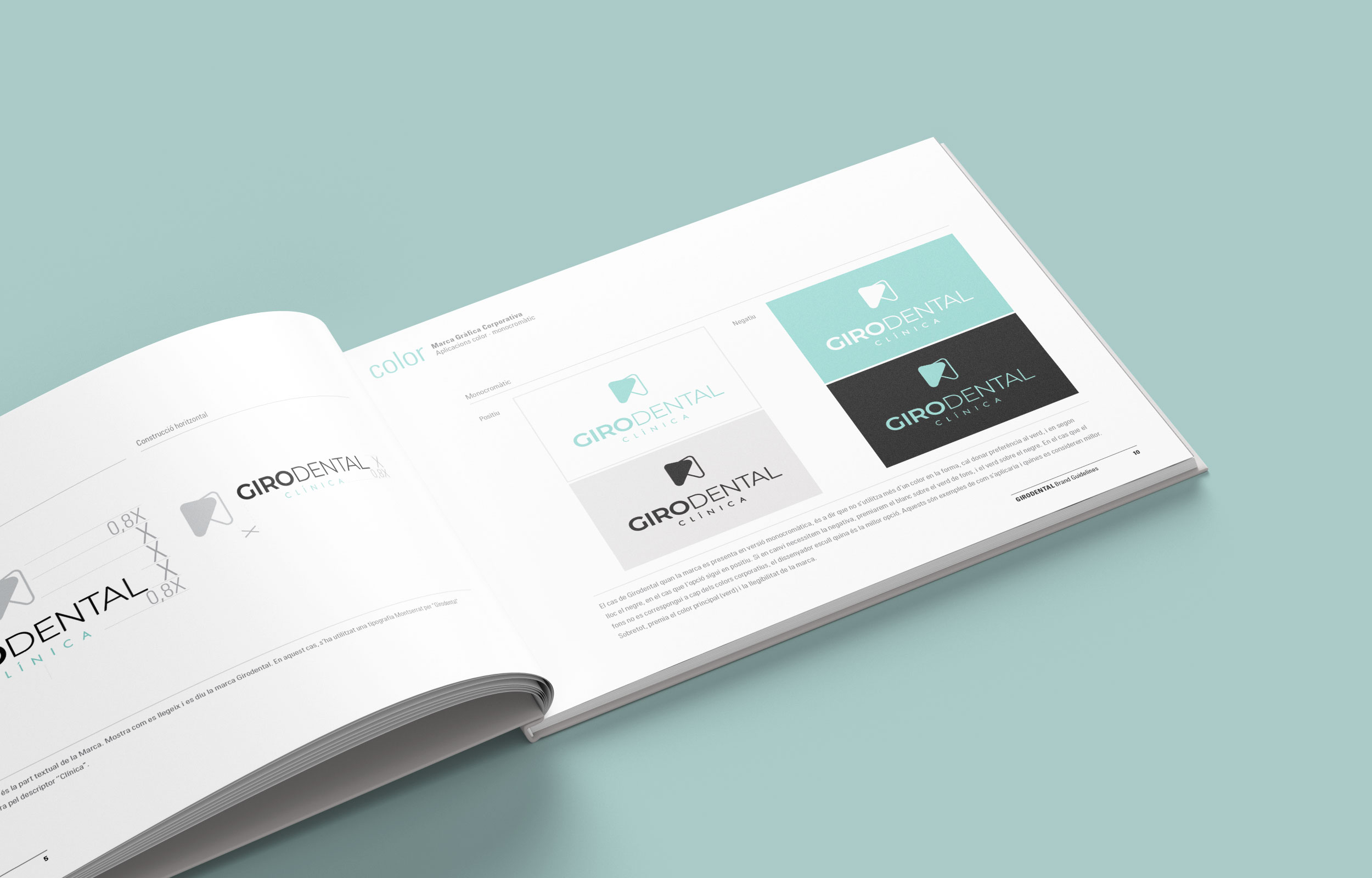
We have also developed the Brand Guidelines: it is the document that visually describes the brand (logo, icon, symbol, fonts, colors, proportions, and their application rules). A summary of all the essential aspects to consider when using the corporate graphic brand, including how to use the brand and its variations, as well as the colors and sizes for application on all types of media.