Serrat Consulting offers consulting services for freelancers and businesses, providing support throughout the decision-making process. They rely on experience, knowledge, and synergies with other market players to design a support and guidance strategy for businesses, always with creativity, adaptability, flexibility, and rigor.
GRAPHIC BRAND
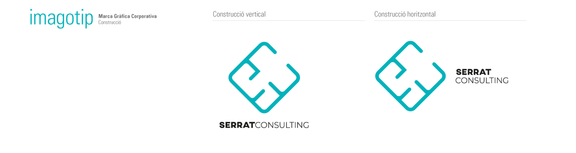
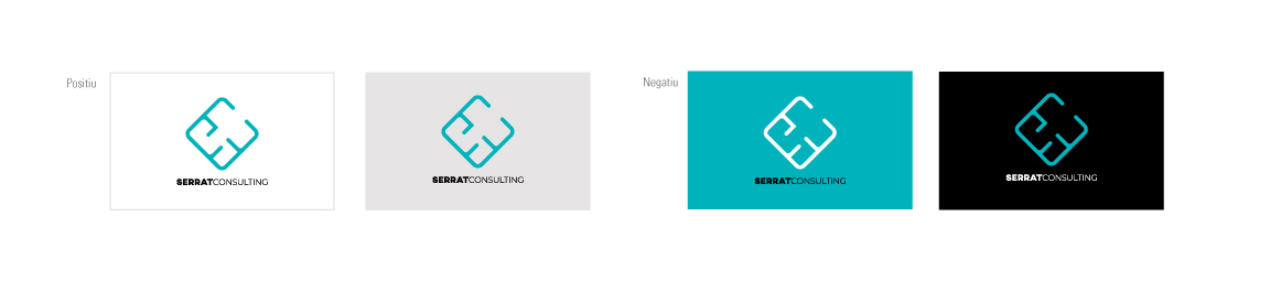
The logo is composed of two typefaces. On one hand, the Axis typography (SERRAT) is a sans-serif font that draws its design inspiration from the geometry of the urban environment, featuring simple shapes with a solid structure. It is commonly used in editorial design to emphasize headlines and relevant content. On the other hand, the Montserrat typography (CONSULTING) revives the beauty of urban typography from the first half of the 20th century, with a geometric style and subtle optical adjustments, allowing for a functional and contemporary design.
CONCEPT
When a company finds itself in a complicated business situation and sees its stability at risk in some way, it's as if it's in a labyrinth, with many possible options and paths, but only one viable way out. This concept is the basis of the logo designed by Serrat Consulting. Using the first two letters that make up the brand's name, the "S" and the "C," we have created a graphic element resembling a labyrinth, with a single exit to the outside. In this way, the logo represents the brand's primary goal: optimizing the company to navigate out of a challenging situation and achieve commercial success.
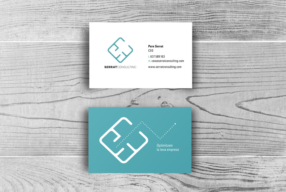
STATIONERY
The application in stationery enhances both the brand concept and the visual elements that compose it: typography, shape, and color. Pere Serrat Consulting has developed the cards with a matte finish and selective UV glossy varnish that creates reflections with the light.