CONCEPT
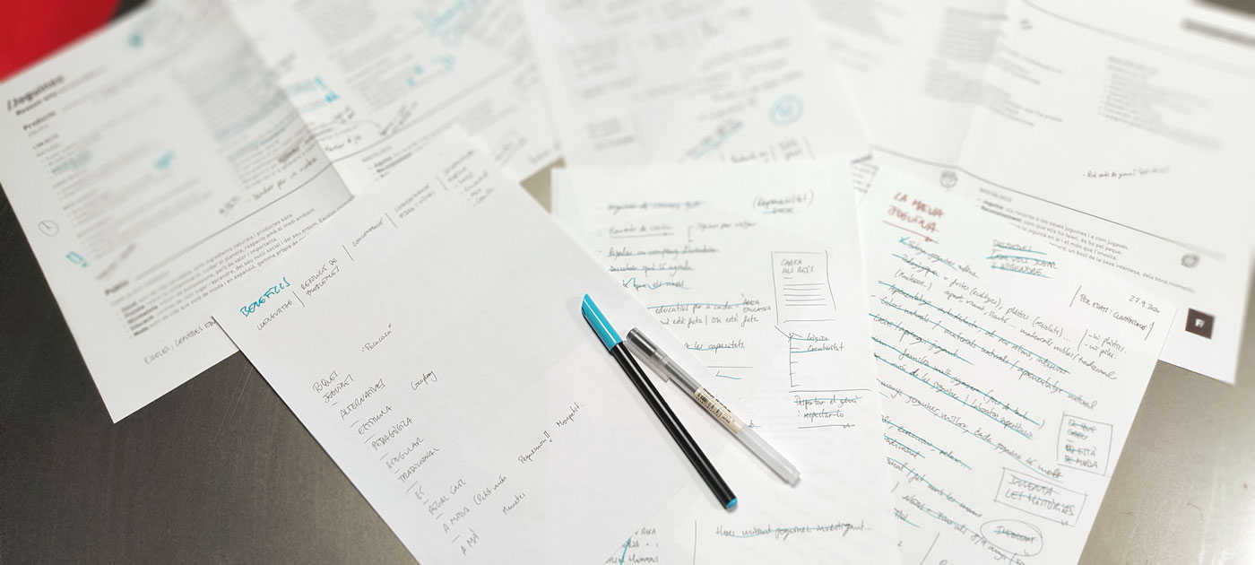
The first step is to talk to the client and thoroughly understand their project: what they do, what are the significant benefits for the client, what are their unique values, what products they sell, what services they offer... In other words, an in-depth study of the company to build the brand. The second step is to work on the Reason Why, which means "what we want to demonstrate." The third is the USP or Unique Selling Proposition, in other words, the primary unique selling argument. This entire process is developed hand in hand with the client until we reach a satisfactory point. Now we can proceed with the tactical and creative aspects when we have achieved a clear and unique strategy.
—
NAMING
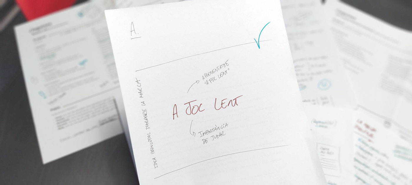
We start working on different naming, proposals based on key concepts and keywords. In this case, around thirty of them. From these, three finalists emerge, and in the end, one winner: A Joc Lent. The concept arises from the learning that the child develops with the toy: they play, and they do it slowly. We combine the two concepts into a ready-made phrase that is already part of our client's vocabulary.
—
GRAPHIC BRAND
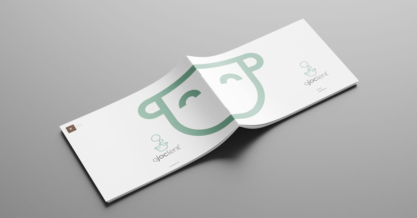
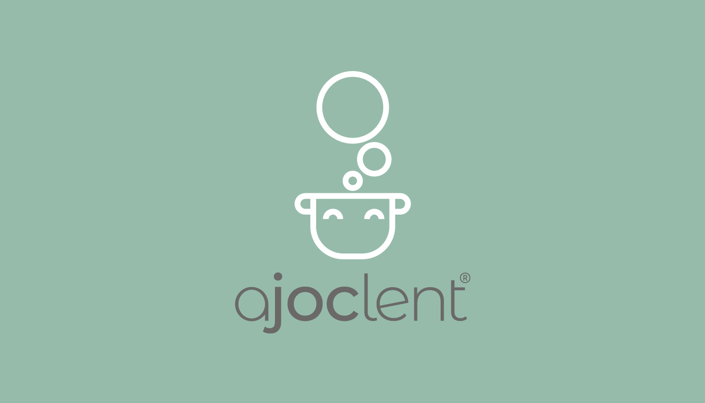
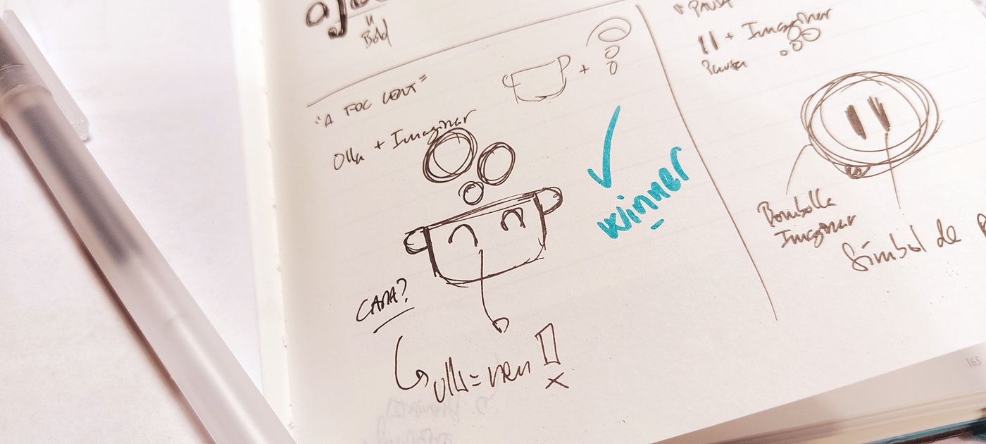
We are looking for a typography that conveys simplicity, minimalism, coherence... but without being childish. Let's not forget that the actual customer is not the little child but the adult who buys the toy to give it to the little one. Additionally, we play with light and bold to be able to combine all the letters and construct a single word that maintains the readability of the phrase within it. That's how we build the logo. Regarding the pictogram, the iconic element, we explore various concepts, with three finalists. The winner prominently features a pot, a symbol of cooking and also a colloquial way of saying 'going crazy' (In Catalan we say 'se t'ha anat l'olla', and it refers to a pot) in the midst of the cooking process. The handles allow us to remember ears, and with two half-bubbles, we create the eyes. Now we have the image of the little child making bubbling sounds while playing. Colors are also a very important psychological element that helps us convey the brand's values.
—
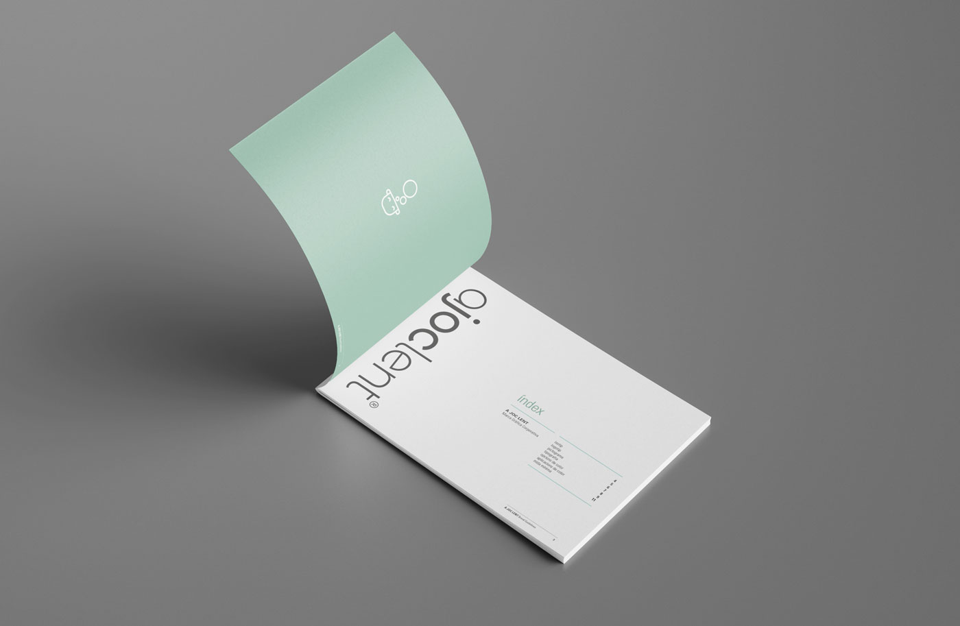
BRAND GUIDELINES
In the graphic branding design process, we create the Brand Guidelines: it is the document that visually describes the brand (logo, image, icon, typography, colors, proportions, and its application rules). A summary of all the essential aspects to consider when using the corporate graphic brand, including how it should be used and its variations, such as colors and sizes for application on various media.