Graphic Brand
—
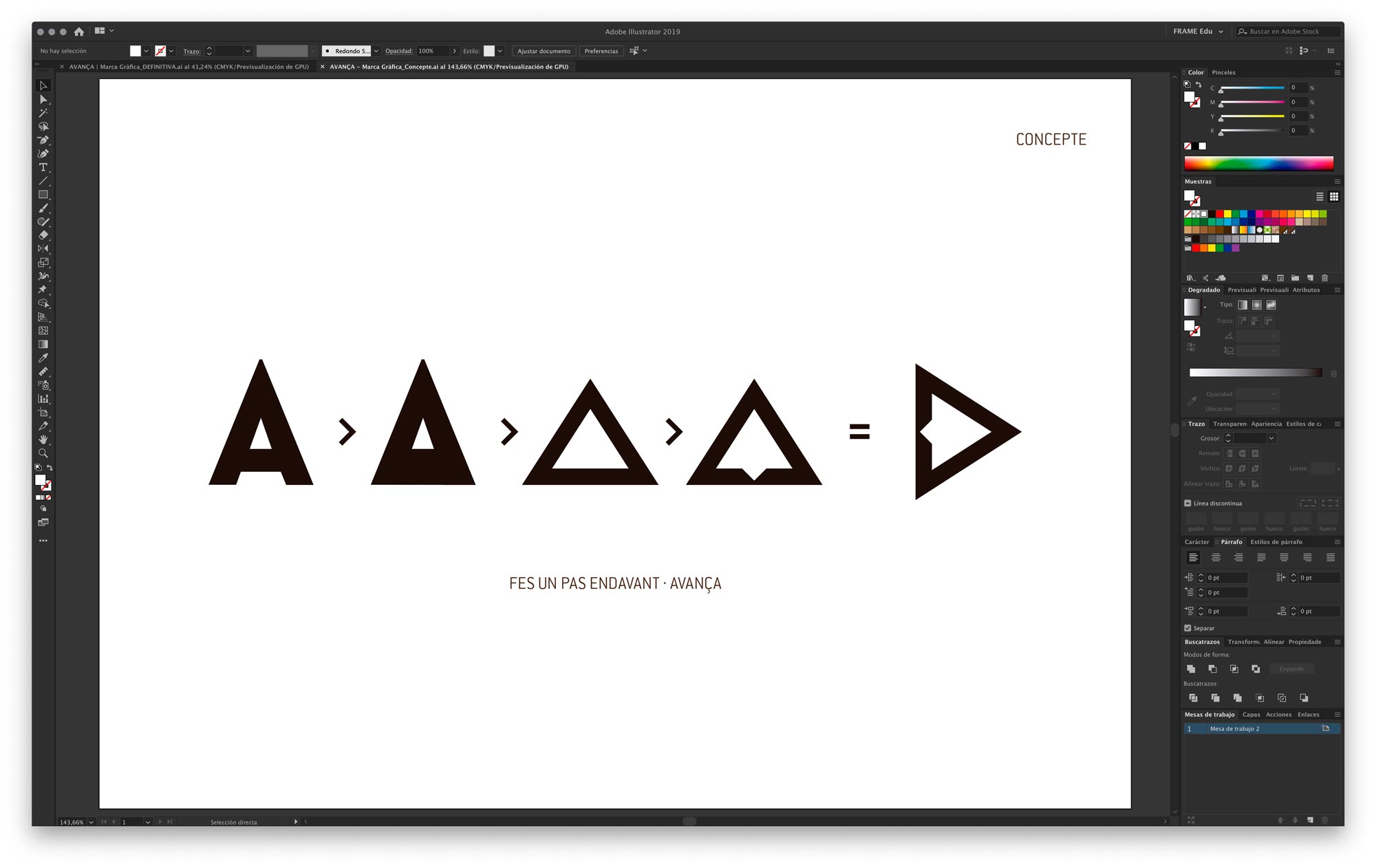
Concept and form
The idea for developing the pictogram arises from the deconstruction of the first "A" in Avança into its minimal graphic form: the triangle. The name itself carries a powerful concept: to advance, that is, to move forward. Once the "A" is reduced to the triangle (with a small graphical detail), we observe that the triangle placed on its base is completely stable (think of pyramids, for example), but it needs to advance, to move... that's why it rotates 90 degrees to the right, and we have the forward motion (in the Western world). Think, for example, of the Play button.
—
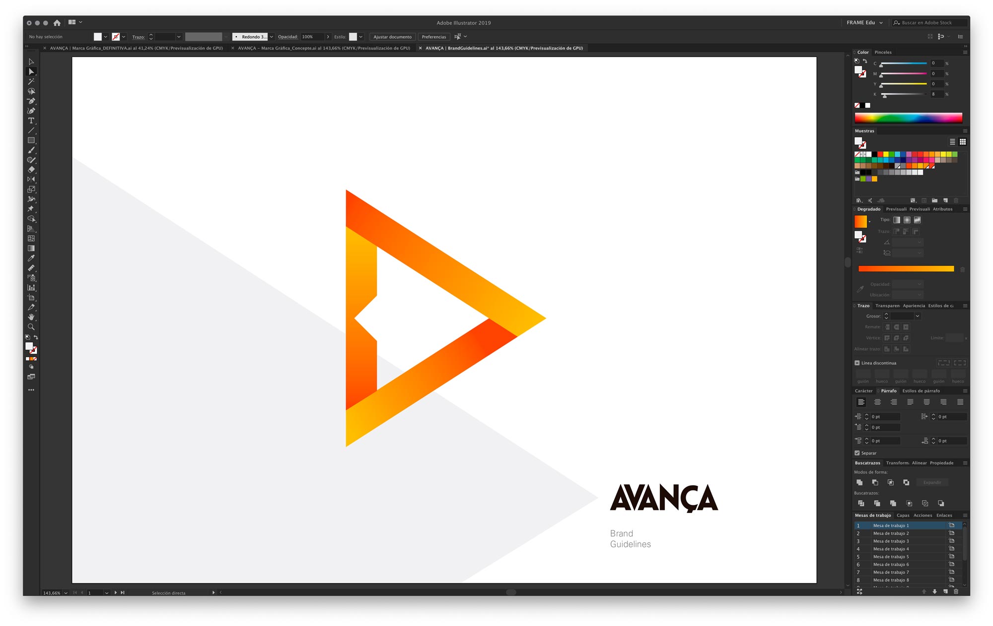
Colour
In order to choose the colour, we need to go back to the origins of the school, more than 10 years ago. The original colour of the first logo was orange. At that time, Avança was only a dance school. Currently, it has also acquired the "Peter Kluge" gym, which used a color palette ranging from yellow to a reddish tone. Combining the colours in a gradient, we find that on the far left we start with the lightest, yellow; moving towards a very dark orange (almost red) on the far right; and right in the center, the original orange is generated. Additionally, the gradient allows us to create the sensation of volumes within the triangle and also takes us back to the original "A."

—
Brand Guidelines
We also developed Brand Guidelines: it is the document that visually describes the brand (logo, image, icon, typography, colors, proportions, and its application rules). A summary of all the essential aspects to consider when using the corporate graphic brand, both in terms of how the brand and its variations should be used, as well as the colors and sizes for applying it on all kinds of media.
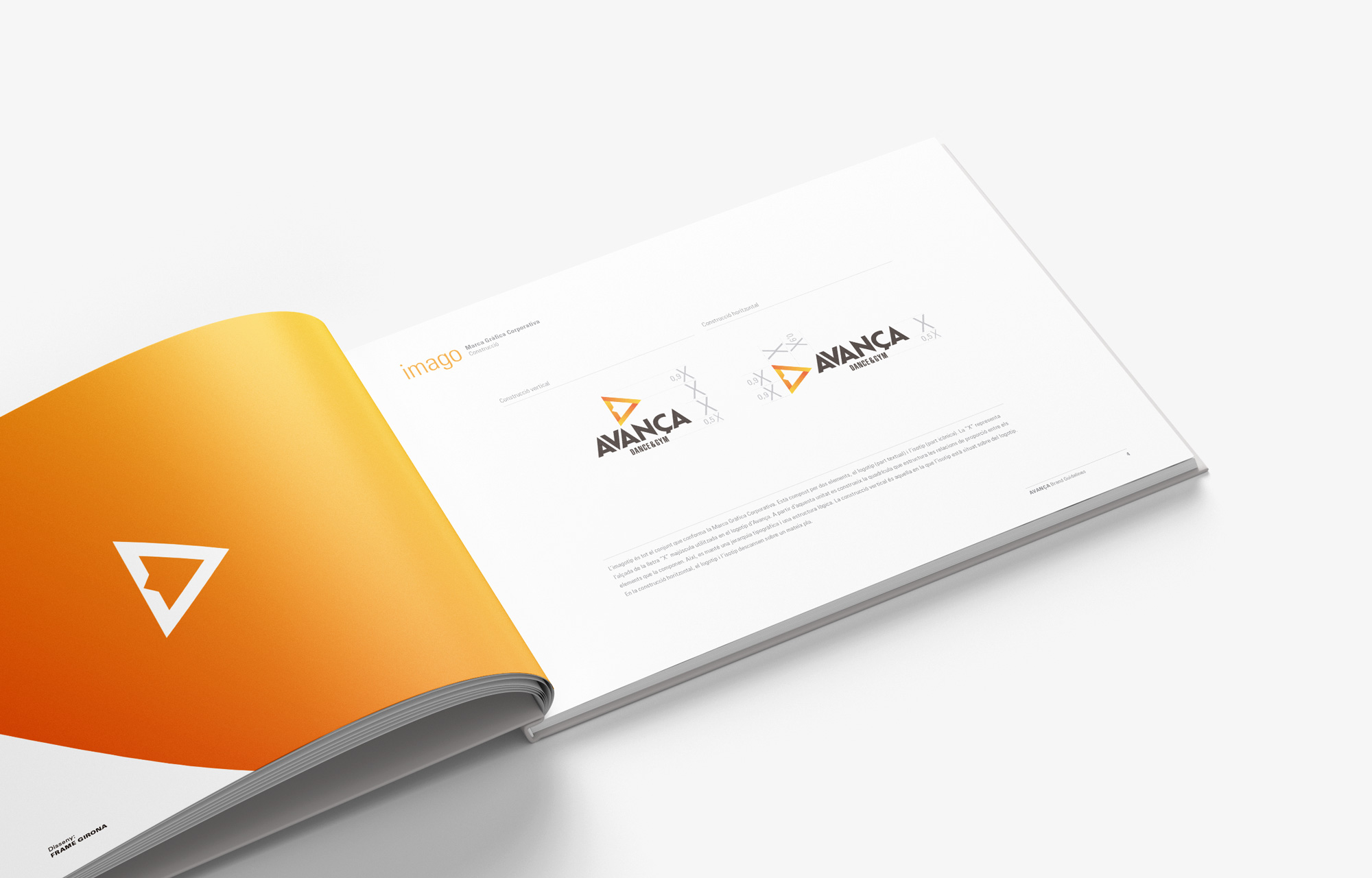
The Brand Guidelines allow defining how the brand will be applied. This way, all necessary materials can be developed, such as stationery (business cards, A4 papers, flyers, brochures...), signage for the premises, and promotional elements, as well as digital media. The Corporate Graphic Brand is designed and intended to be applied on any medium under any conditions.