GRAPHIC BRAND
For Bàrbara, we have created a very minimalist and delicate graphic mark: taking advantage of the visual balance of the two words that make up the name "Bàrbara" and "Jorquera," we have placed the pictogram in the center, an icon representing 3 leaves (natural) that create a heart-shaped negative space (beauty). We also developed the concept of the brand as "Your Personal Beauty".
![]()
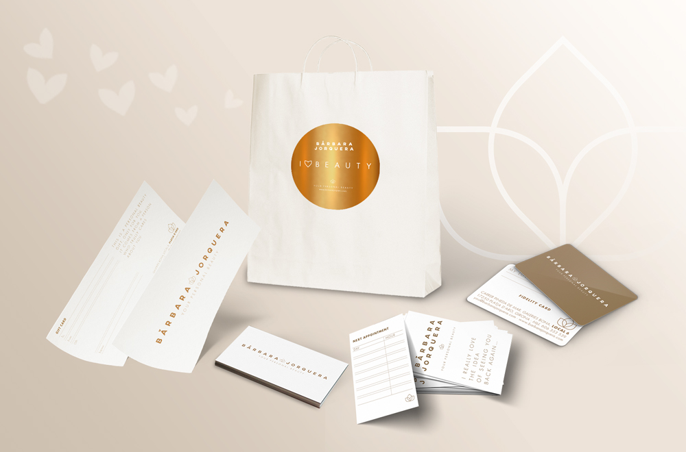
APPLICATIONS
For Bàrbara, personal interaction with the customer is very important, which is why we have developed a variety of graphic materials to be handed directly to the customer (bags, business cards, club cards...) and all the center's signage. They all enhance the corporate color of the brand: gold. A different printing technique has been applied to each medium to maintain continuity.
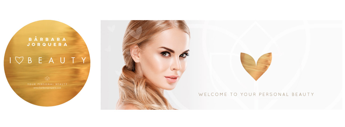
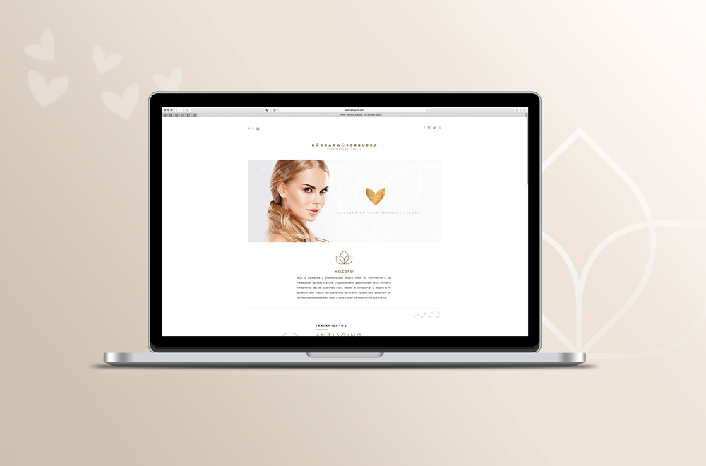
WEB ONE PAGE
Once the corporate visual identity and stationery are defined, the one page website is designed in a vertical format (all the information on a single page that allows viewing it all with just scrolling), including the contact information and all the treatments offered by Bàrbara at her center.