Graphic Brand
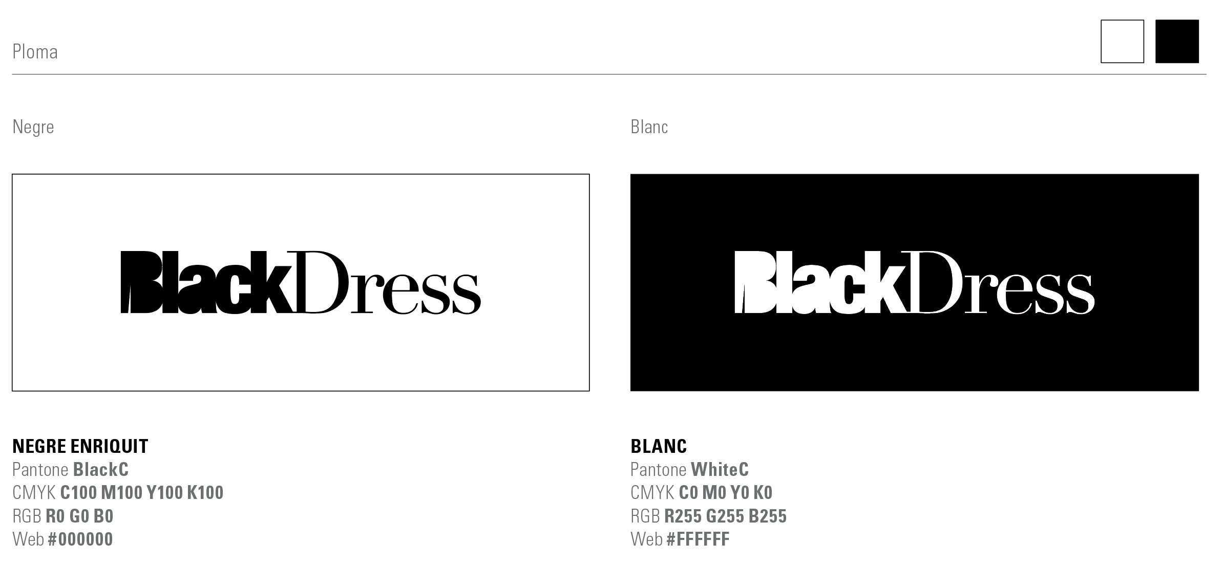
The logo is the textual part of the Corporate Graphic Brand; it shows how the brand is read and pronounced. In the case of Black Dress, we have created an isologo, that is to say, a pictogram integrated within the logo itself. The concept is expressed in a way that the brand represents the construction of a solid, massive, and black block (with the following image, we can see this effect exemplified). Secondly, we can observe as a key element of the isologo, the opening for the leg of an elegant dress, which is reflected in the letter "B" of it.
![]()
—
Brand Guidelines
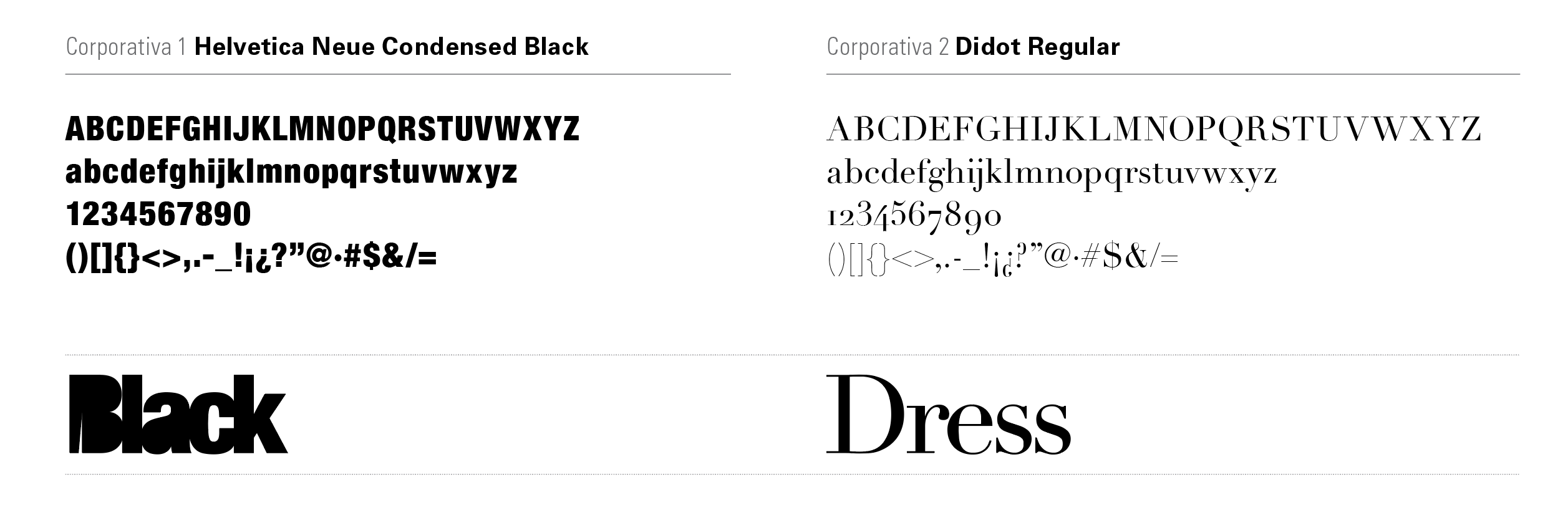
We have also developed the Brand Guidelines: it is the document that visually describes the brand (logo, fonts, colors, proportions, and its application rules). A summary of everything essential that must be taken into account when using the corporate graphic brand. In this case, two fonts have been used: Helvetica Neue Condensed Black for "Black" and Didot Regular for "Dress."
—
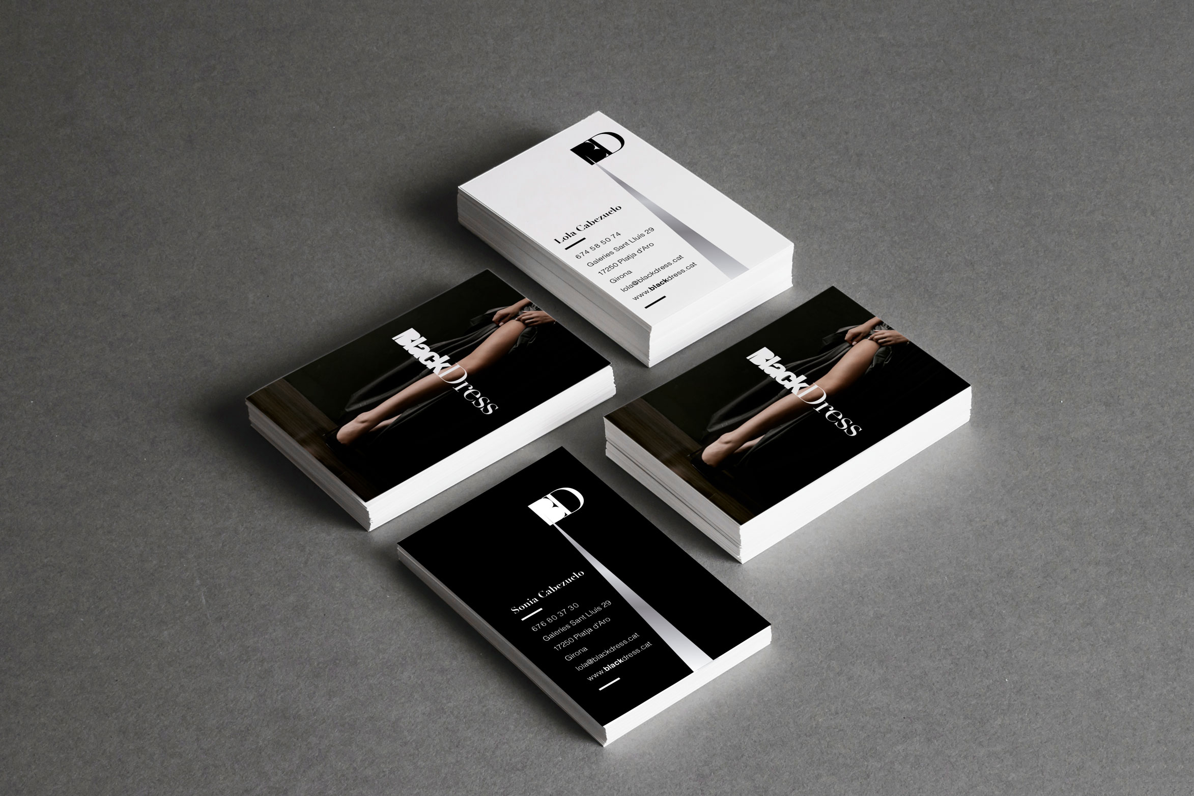
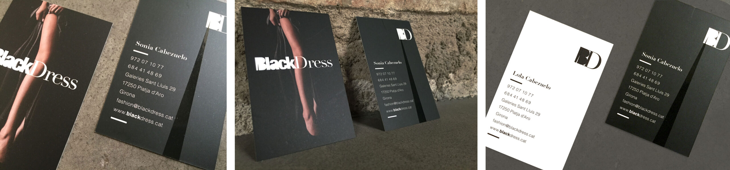
Nominative Cards
The personal cards of Black Dress once again respond to the brand concept: the opening of an elegant long dress showcasing a feminine leg, where a selective varnish technique has been chosen to achieve this spectacular effect, which conveys the analogy between the dress opening and the opening of the letter "B". Furthermore, taking advantage of the business organizational chart, i.e., the two founding partners, both applications of the logo are used: in negative and in positive.