Graphic Branding
Today we present the new graphic brand of Celler del Tast! A logo made up of an isotip (graphic form) drawn freehand, which evokes the fluidity of the wine in the glass, with elegant and dynamic lines; we have created a personalised illustration for a company that offers a completely personalised service to its customers. The graphic part of the brand visually represents its values and helps to give it properties, attributes and optical recognition to the whole. It can be used separately, as a singular element, and is a very useful resource for graphic compositions.
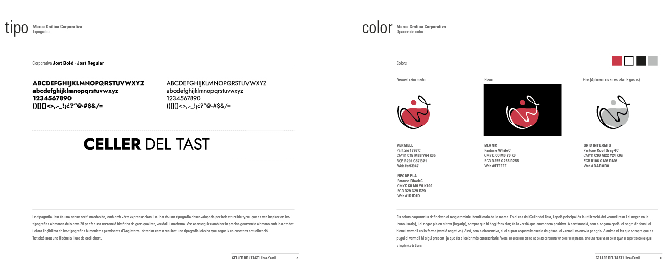
The typographic part of the logo is a combination of two thicknesses of the Jost tipografia. This is a sans serif, rounded, with pronounced vertices. Jost is a typeface developed by Indestructible type, who were inspired by German typefaces of the 1920s to make a high-quality, versatile, and modern historical recreation. They managed to combine the precise German geometry with the cleanliness and clear legibility of the humanist typefaces from England, obtaining as a result an iconic typeface that continues to be constantly updated.
![]()