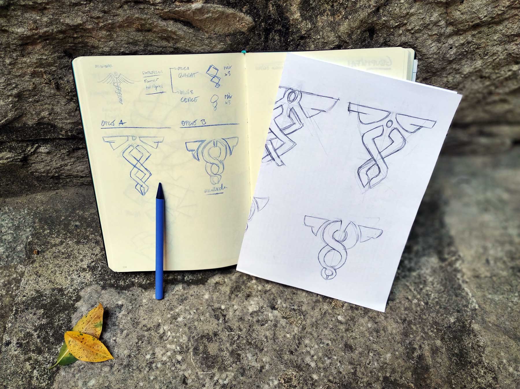
Origin
The development of the isotype takes as inspiration the classic symbolism of the nursing/pharmaceutical field. It is those two serpents that intertwine on a rod or sword, with a cup with "wings" on top. Symbolism that we all have in mind. To make it more modern, a minimalist redesign is proposed. Thus, we develop two options:
- Square base: the square as a structural and basic shape element.
- Circular base: the circle as the basic shape. This option is more dynamic, less classical, and ends up being the winner.
—
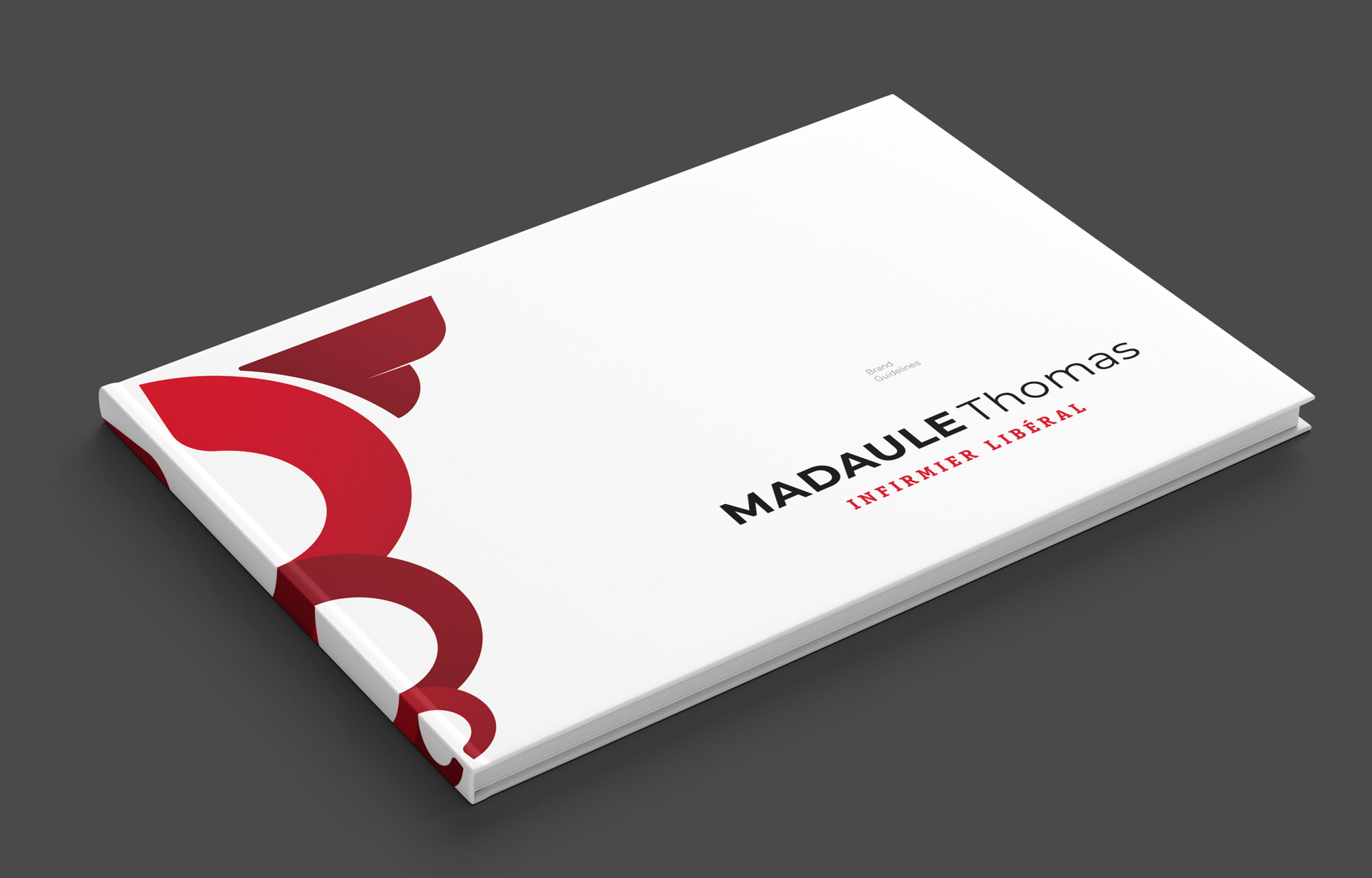
Brand Guidelines
We also developed Brand Guidelines: it is the document that visually describes the brand (logo, image, icon, typography, colors, proportions, and its application rules). A summary of all the essential aspects to consider when using the corporate graphic brand, both in terms of how the brand and its variations should be used, as well as the colors and sizes for applying it on all kinds of media.
—
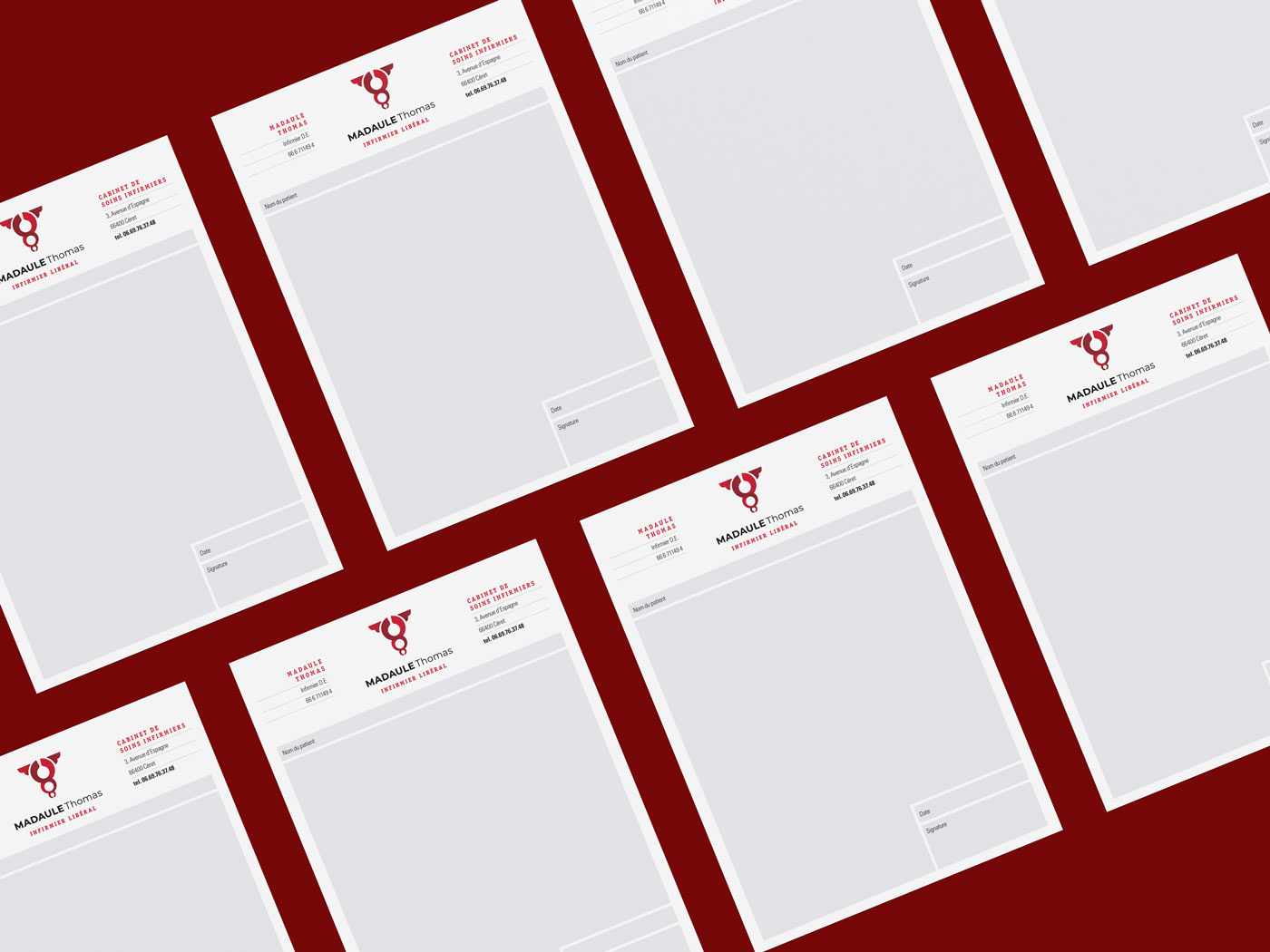
Applications
From the Brand Guidelines, we develop applications, both digital and stationery. We start with the corporate card, which is the one used most frequently. We apply the brand's vibrant colors, as well as a high-quality matte lamination, with an exceptional feel, and a 3D varnish, that enhances the pictogram's volumes.