CONCEPT
The design of the isotype is based on the concept of "People to people," which means the connection between the communicator and the audience like two pieces that fit perfectly and understand each other. The shape is clear, with a solid and balanced structure. If you look more closely, what initially appears as empty space between the lines and shapes is actually an "N," just like in the field of communication, where one must look beyond, at all the details, to obtain all the information from the message.

CORPORATE BRANDING
The typography chosen for the logo is Gill Sans, a sans-serif font that is based on the typography used in the London Underground. With its classic proportions, clean lines, and high legibility, Gill Sans was an instant success when it was created in 1928 and remains one of the most widely used typefaces. Despite its Renaissance roots, Gill Sans can be considered a modern typeface, as its radical geometric shapes are characteristic of the Art Deco movement.
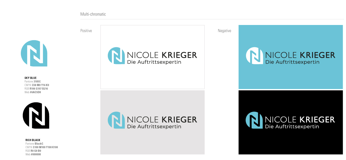
BRAND GUIDELINES
We have also developed the Brand Guidelines: it is the document that visually describes the brand (logo, icon, symbol, fonts, colors, proportions, and their application guidelines). A summary of everything essential to consider when using the corporate graphic brand.