It is a company specialized in sales through Revenue Management and e-commerce focused on the hospitality sector. Through an easy and straightforward process, they make the commercial infrastructure of large hotels accessible to independent hotels. They find the balance between occupancy and price so that their clients maximize their profits, resulting in increased revenue and sales profitability. They provide the most up-to-date and innovative commercial tools and techniques, with a close and personalized approach.
GRAPHIC BRAND
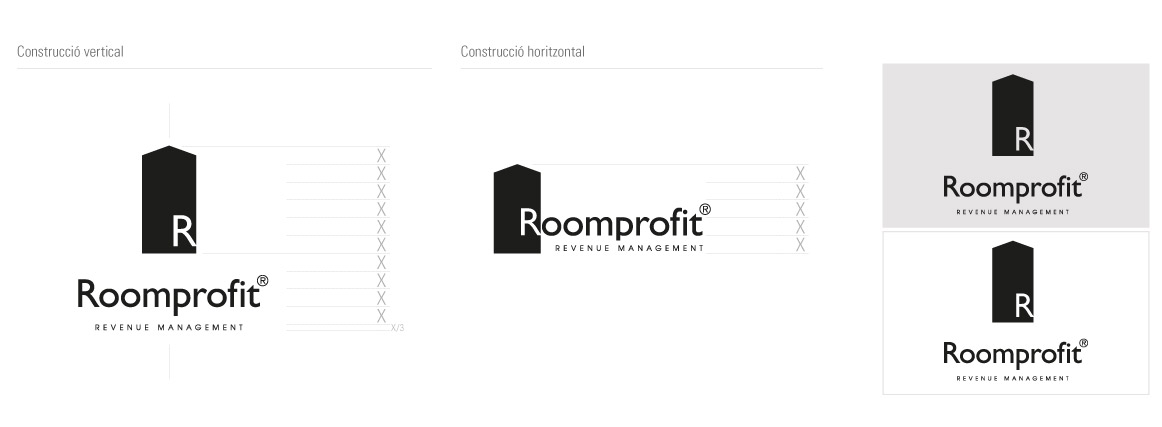
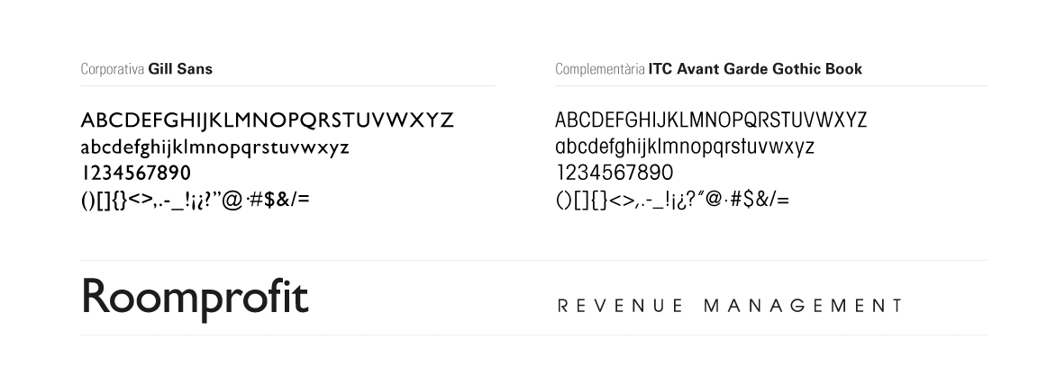
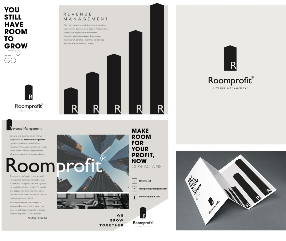
The first step is the creation of the company's naming, which is the written name of the brand: this is Roomprofit®, the synergy between Room and Profit. The iconography enhances the concept of growth, associating it with a house shape. The letter R is positioned in such a way that it generates the sensation of space, as if it is located inside that room. The chosen typography for the logo is Gill Sans. The color is black, in combination with white and a very delicate gray, to evoke Anglo-Saxon designs.
![]()
BRAND GUIDELINES
We have also developed the Brand Guidelines: it is the document that visually describes the brand (logo, icon, symbol, fonts, colors, proportions, and their application guidelines). A summary of everything essential to consider when using the corporate graphic brand.
WEBPAGE
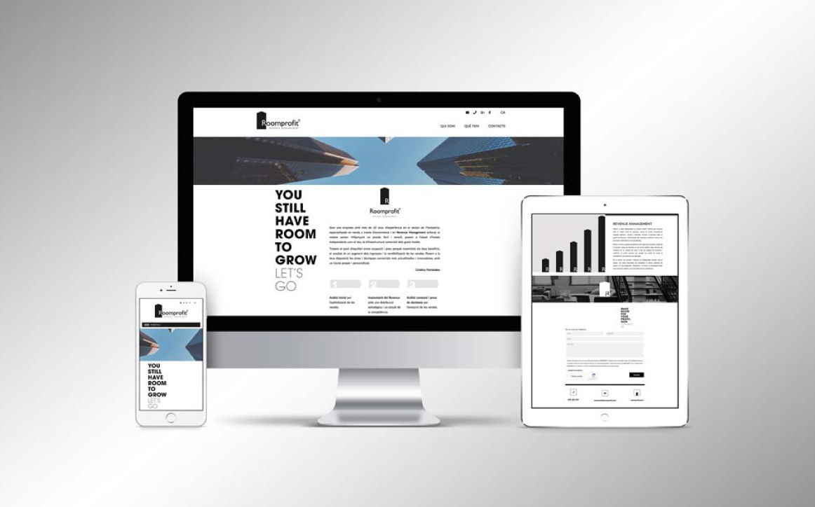
Once defined the corporate visual identity, the one page website is designed (all the information on a single page that can be viewed with just vertical scrolling) with contact information and the main artistic disciplines that can be found at the school. The menu takes you to the web area where related information is located.
BROCHURE
Explain and reinforce the entire brand concept: it is designed to be the sales support when visiting the client to offer business services. The main concept is 'You still have room to grow. Let's go,' which plays with the double meaning of 'room' as both 'habitat' and 'margin'.
STATIONERY
In addition, we have developed all those corporate elements of stationery that represent the brand and display it in every application, following the same codes as the website and the brochure. Here you can see Cristina Fernández's personal card, the main person in charge of the project.