The first step in creating a brand is defining the name (naming,). This shows what you are called and allows you to be identified and referred to 'by name.' It is also very important because it conveys your values. That's why it's crucial to choose your name carefully. In the case of Safeway360, we create the naming from scratch. We explore various options and concepts until we find the one that best fits the client. In this case, we decided to go with English, as it will give us technological connotations as well as an international professional projection.

Safe
Significa: segur.
Way
Significa: camí, via, pas.
360
Significa: tot.
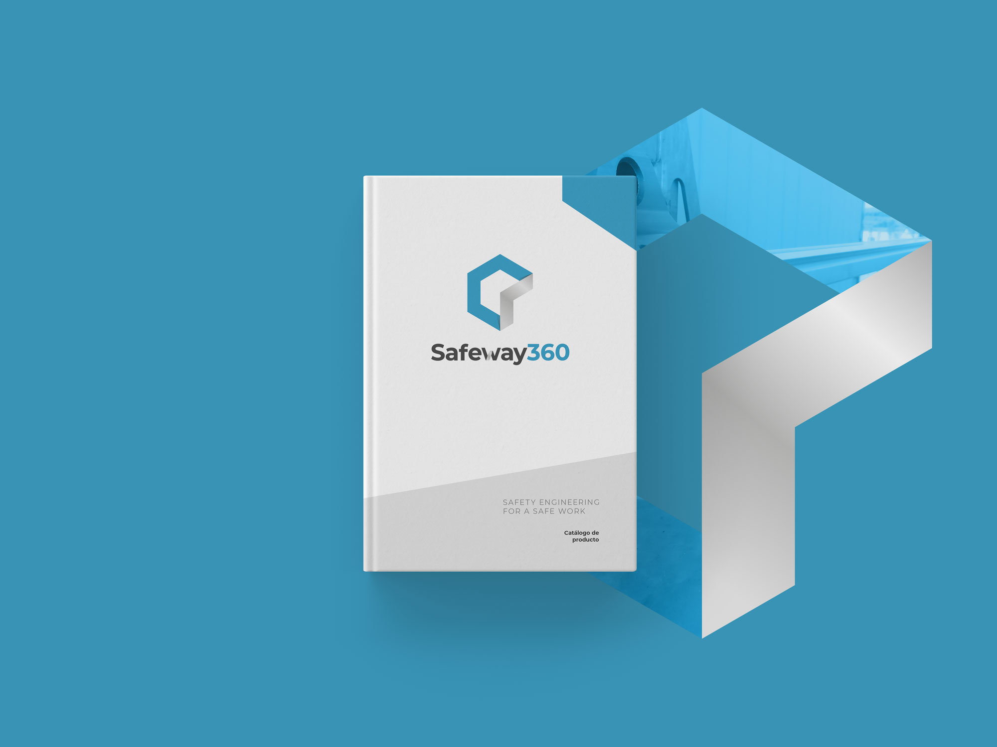
 Graphic Brand · Isologo
The logotype is how the textual part of the brand is represented, typically using a typeface (font). In this case, we have opted for an isologo, which is the integration of graphic elements into the logotype (modification of the 'W' to link it with the graphic gesture of the pictogram. The pictogram is the iconic part of the brand (it has no text). In this case, the concept arises from a panel of bees, a metaphor representing the colony of workers within the company. Therefore, the basic hexagonal shape is modified to represent a path or a safe lane within the geometric figure. Creating both elements (isologo + pictogram) allows us to generate two graphic resources that can work together or separately, increasing the graphic possibilities. When we combine the two elements, we integrate them as one, and we call it an isotype. In this case, a vertical integration (for more vertical formats) and a horizontal one (for more horizontal formats) are proposed.
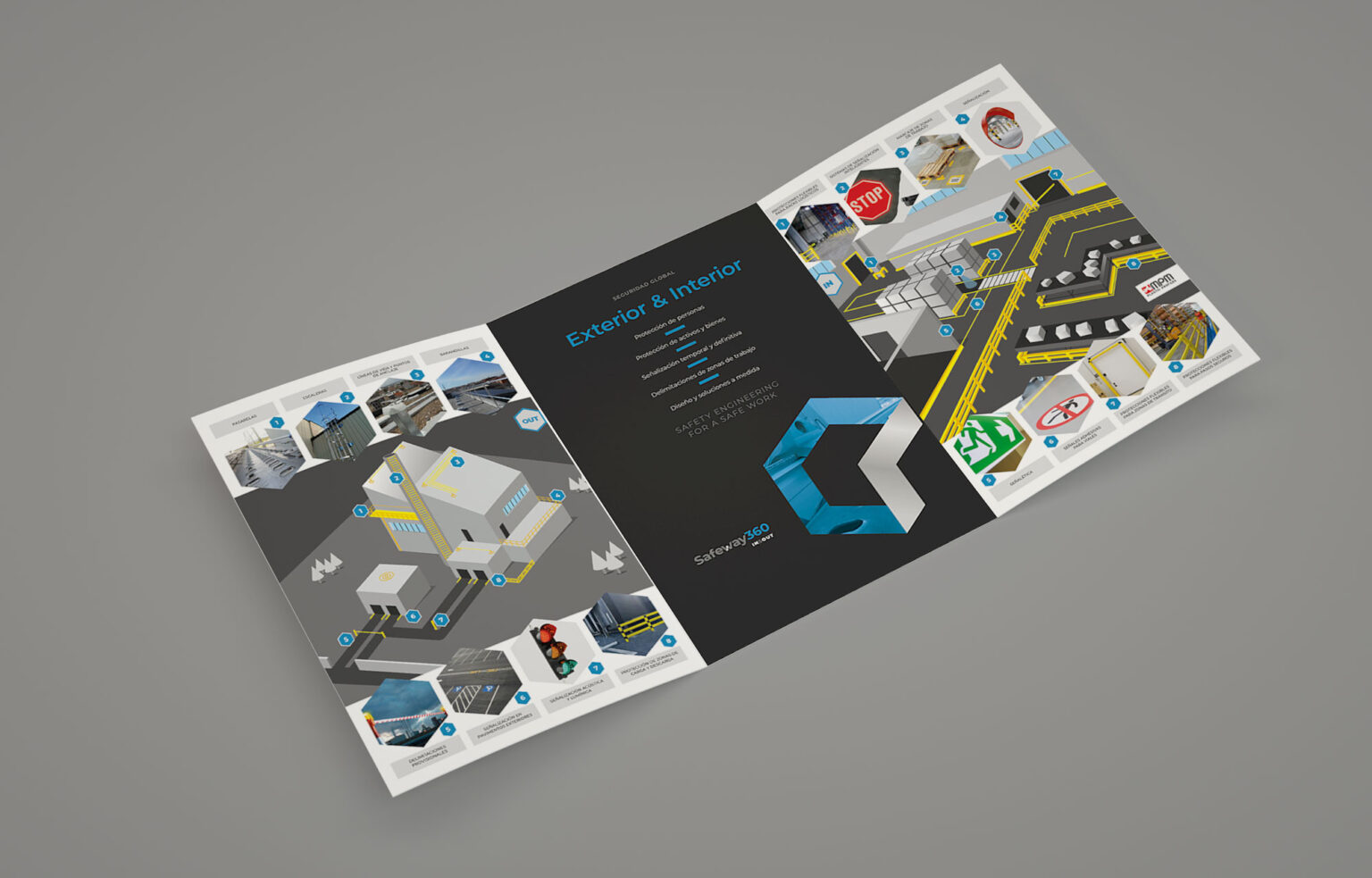
Corporate Catalog
The corporate catalog introduces the company to the world in an offline format (print). In this case, two things were needed: first, to explain the company, and second, the product (services). Therefore, externally, we communicate what the company is engaged in (the more corporate aspect), as it is not a service that the customer commonly knows but rather an innovation. Let's focus on the interior. the second element (upon further reading), the objective is to visually demonstrate what the product can do for the customer by explaining its functionalities without showcasing final products. For this reason, and with the intention of not focusing on any specific client, we opt for vector illustration. Thus, we create them ourselves to measure, taking into account communication needs (explanation, adaptation to the product, brand color palette, the same graphic style...).
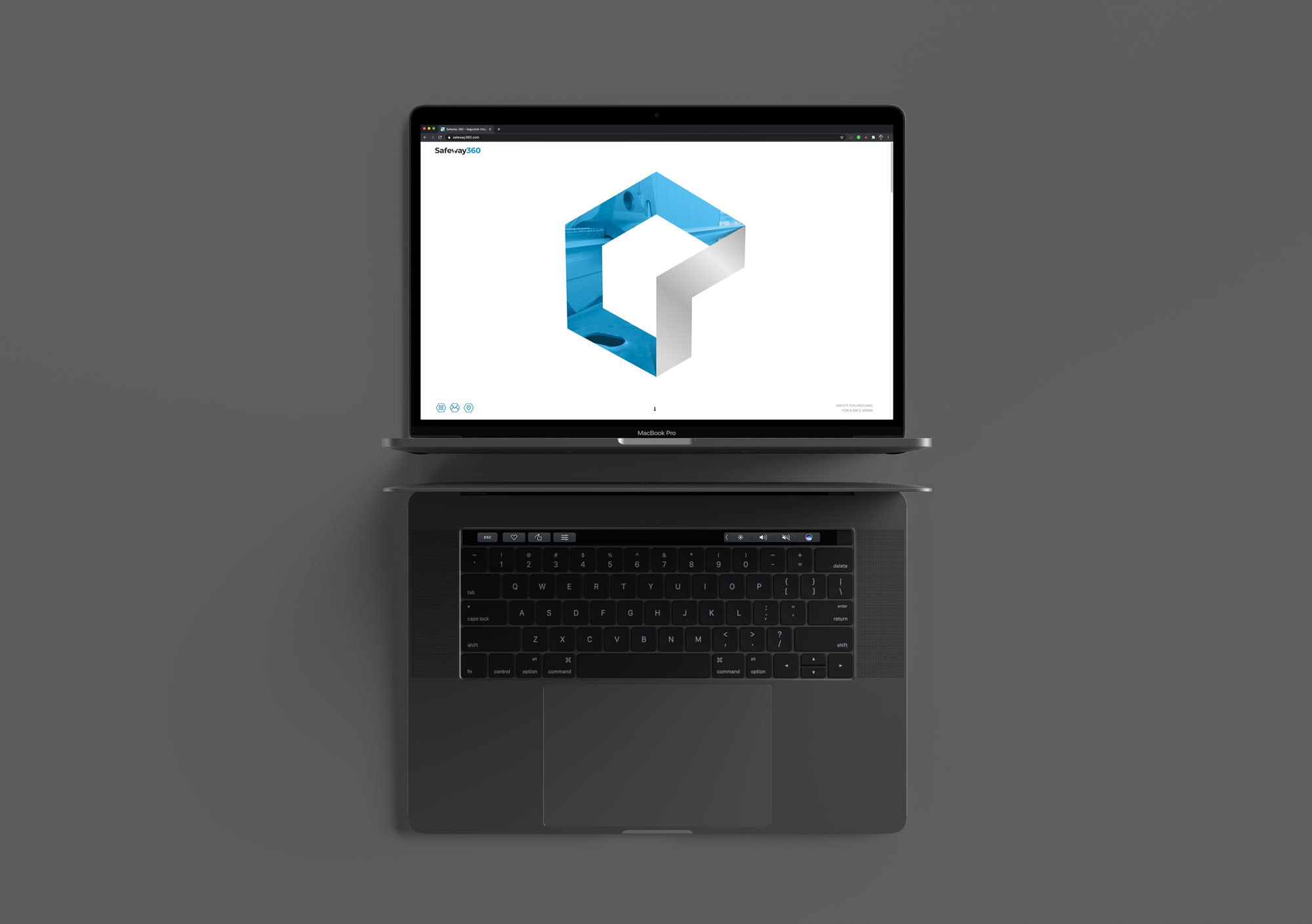
Website
The website, on the other hand, presents the company to the world in an online (digital) format. The messages communicated are practically the same as the catalog, with the difference that it allows us to generate more animations, a smoother narrative, and direct actions (call-to-action), especially when it comes to facilitating contact through the various channels available to the company. It's a one page website, with interesting information such as what's happening on social networks, maps, contact details... Like all the websites we create at Frame Girona, adaptive to devices with good SEO and programming, for easy loading in the browser and strong positioning on Google. The website adapts to your mobile so you can take it with you anywhere, even to accompany you during your visit.
Application
The corporate graphic brand is designed to be applicable in a multitude of situations. It is easy and efficient to reproduce, allowing for adaptation without encountering any resistant formats. In this case, Safeway360 is intended to coexist in industrial environments. We have also developed the company concept: "SAFETY ENGINEERING FOR A SAFE WORK.