—
Concept
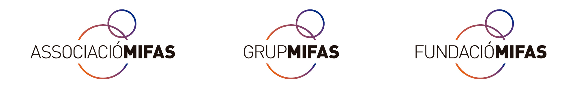
Graphic identity for the Mifas Group. We have conducted a comprehensive study of the original graphic identity, in which we analyze the logo and the pictogram, the two elements that make up the original graphic identity.
- In the case of the first one, in the textual part, we choose to remove forced lowercase at the capital letter height and standardize the reading. We believe that conceptually, what Mifas does is to minimize differences as much as possible and level people with disabilities and those without, so it's important to put them all on the same (typographic) line. We work with two thicknesses: light for the Group (it will adapt) and bold for Mifas.
- In the case of the second element, the iconic part, we simplify the element to the maximum. We remove all unnecessary elements: the rectangle and the "character." We reduce it to two interacting circles (representing the person and the chair, without directly depicting the person and the chair).
- And finally, we integrate everything into a single element called Isologo (logo and isotype as one element).
—

—
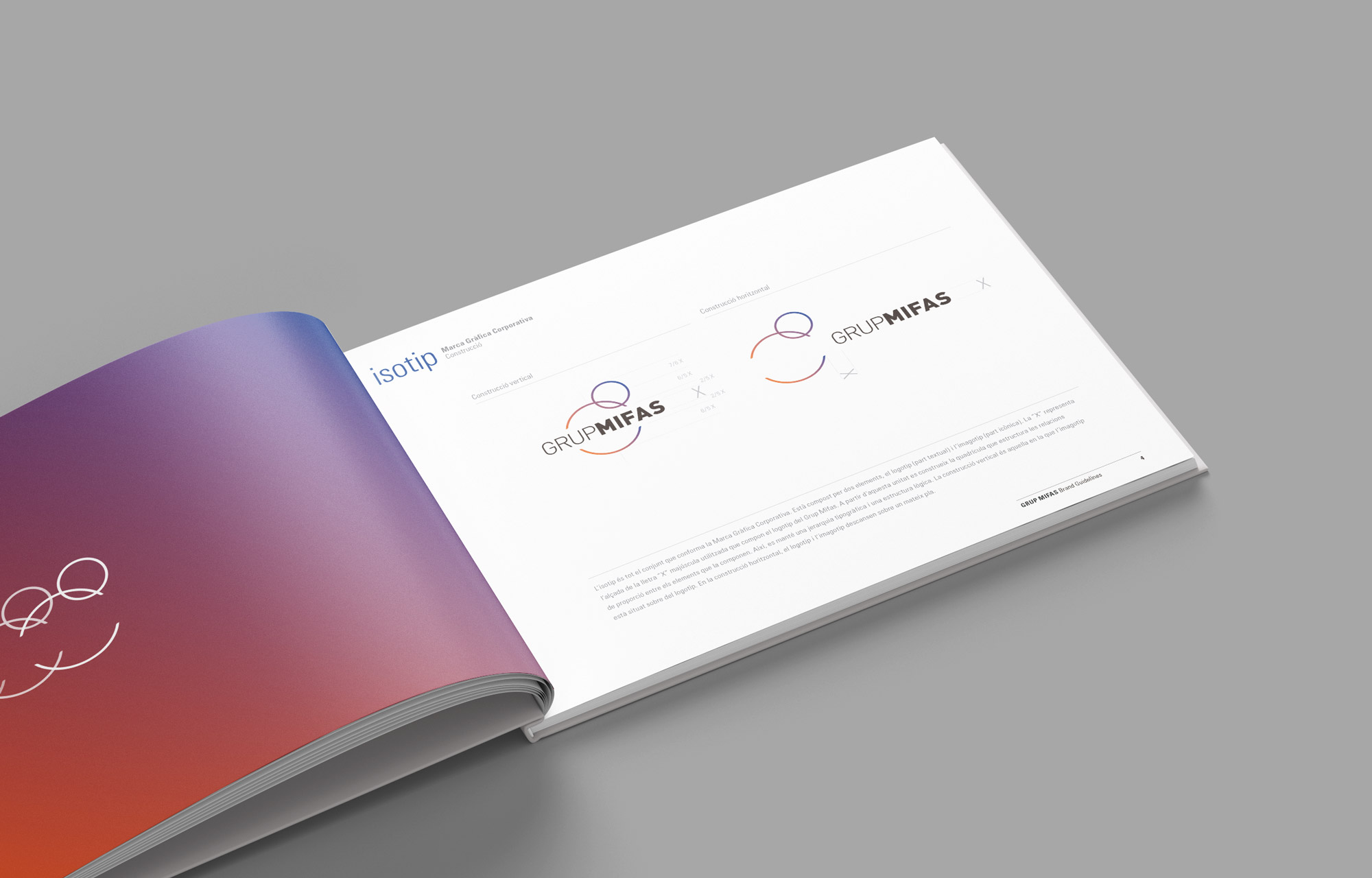
Brand Guidelines
We also developed Brand Guidelines: it is the document that visually describes the brand (logo, image, icon, typography, colors, proportions, and its application rules). A summary of all the essential aspects to consider when using the corporate graphic brand, both in terms of how the brand and its variations should be used, as well as the colors and sizes for applying it on all kinds of media.
—
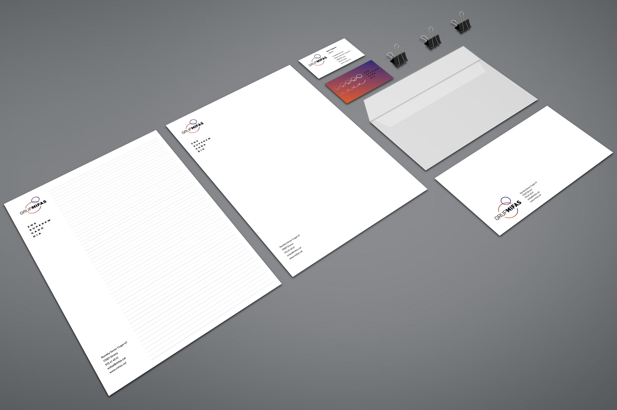
Applications
The Brand Guidelines allow us to define how the brand will be applied across all elements. Stationery (business cards, A4 papers, envelopes...) is the first to be designed and defined. From there, other elements are worked on, such as the website, newsletter and promotional materials (roll-ups, flyers, posters…). It is important to find a balance between variety (interest) and continuity (recognition).
—
Negative
The negative application (which requires changing the primary colors of the graphic brand, in this case replacing the black in the logo with white) is an option to consider. It is reserved for those more important occasions, in moments of greater elegance and subtlety. (See the featured image)