UFEC contacts us because they have the need to cover the creative and graphic aspects in many areas that are beyond their control. In this case, the brand is Esport+, an integrated system that uses artificial intelligence cameras and an online platform (OTT, like Netflix) to make all sports matches and competitions available to anyone who wants them, when until now the only way to enjoy them was to go to the stadium.
CONCEPT
The first exercise we do is to study the project, understand it, and ask ourselves 'what does it really bring to the consumer?' After much thought, meetings... the idea comes to us: parents are the ones who 'suffer' their children's games, on Saturdays, Sundays, etc. They have to leave everything to go watch their child compete. It is true (in most cases), as well as the fact that the day they can skip it, the first thing they ask is 'how did it go?' and 'did you score?'. The insight, therefore, is that parents don't care so much about watching the game itself as they do about their child having 'triumphed.' This is how we create the first claim proposal:
“No te’n perdràs ni un més!” (You won't miss a single one!).
Once the text is outlined with the client, we modify it to obtain the final message:
“Ara ja no tens excusa! Viu-lo allà on vulguis!” (Now you have no excuse! Live it wherever you want!).
—
CAMPAIGN CREATION
Help resolve a series of doubts regarding the corporate visual identity and consider it final. At this stage, we already have a concept (what we communicate), and we need to work on the campaign's imagery (how we communicate it), building the visual code.
CAMPAIGN IMAGES
We need the campaign to be very visual and intense. We are going to search for images of all the affiliated federated sports (more than twenty) in which athletes are seen in that moment that parents (and supporters) are eagerly looking for, the expression of victory. We select them, cut them out, and apply them against a red background, blending them with a gradient to create a dramatic effect while also generating a focal point (with more light) centered on the facial expression. In this way, we achieve high-intensity and tension images, similar to what the protagonists experience. It's also very important that they can identify with them.
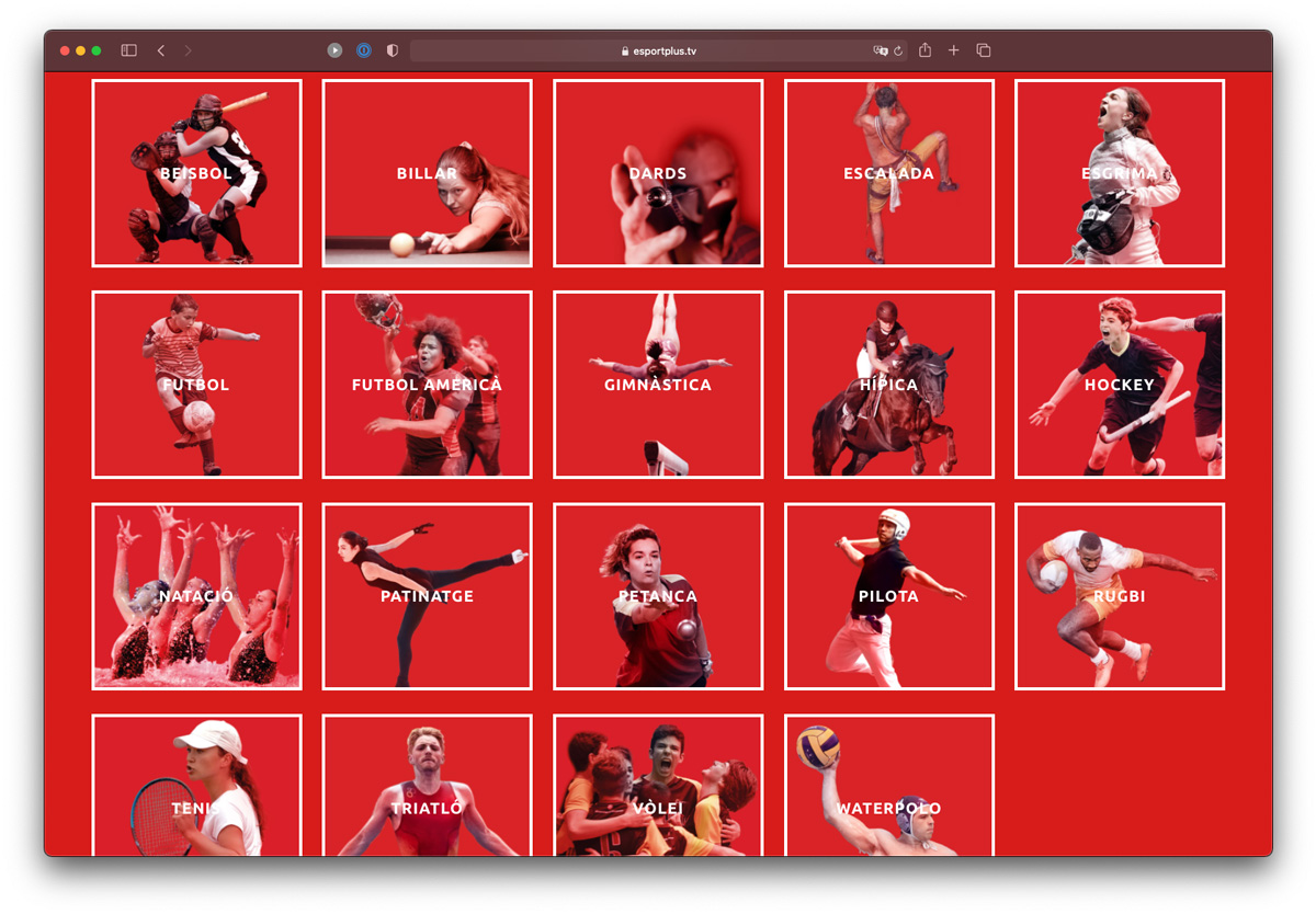
color palette of the entire campaign revolves around three colors: red, blue, and white. We use the color red to evoke power and intensity, the passion of athletes. We employ the color blue for the more corporate aspect, which, in contrast to red, conveys a sense of tranquility. With white, we separate the sections with lines and squares reminiscent of field markings.
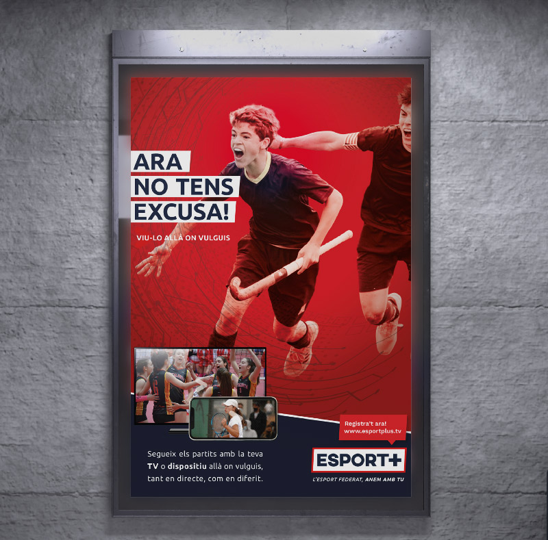
POSTER
It's an ideal format to start working with: large enough to display the image and maximum content in its full glory, and without the complexity of a brochure, for example. The typography, the two colors, the secondary elements, the hierarchy of these elements, the messages to convey... everything is structured and arranged so that the message is: the impact of the image and the concept of the campaign slogan, on a red background (intensity, anger, passion) which is the OTT (photos of the devices and text) and the logos of the participants on the red background (calm, security, transparency). We also play with the inclinations of the images and the lines to add dynamism and with a circular effect that resembles a camera lens.
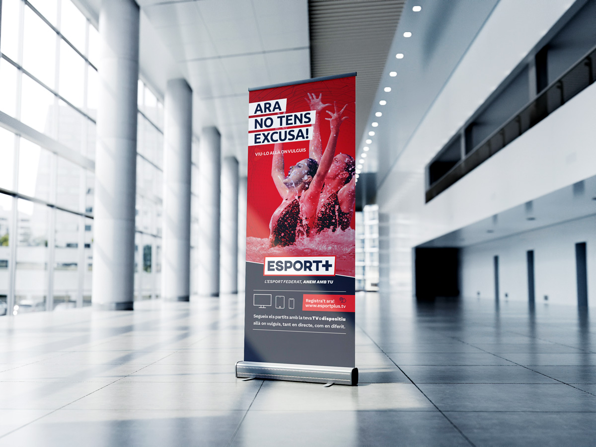
ROLL-UP
It's a really important piece, more vertical and complicated than the poster, with the advantage that it will be where we do the broadcasts. For a project with these characteristics to work perfectly, the trick is to start with the foundation, with the people who are part of it and are involved, to turn them into advocates and generate organic communication along with exponential growth. This is the ideal support, as it will be located at the main entrance where all attendees will pass through (players, family members, spectators, referees, staff...) and they will see it. They need to be very clear that the product exists; there needs to be visibility because we want to involve them.
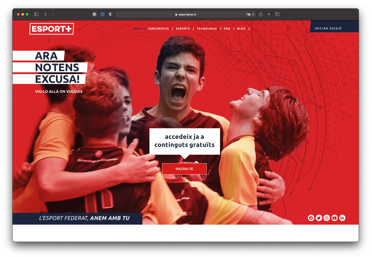
WEBSITE
website is the epicenter of online communication. It's the element that collects and channels traffic, allowing us to expand information, showcase it to its full potential, play with animations and user interaction, thus creating a reading process in which we will unfold key messages. Also, let's not forget that the website has two main functions: channeling traffic to view the broadcasts (initially on YouTube and Social Networks), as well as obtaining subscriptions (because the future of Esport+ depends on the number of paying subscribers we can convert from those who have signed up on the website).
NEWSLETTER
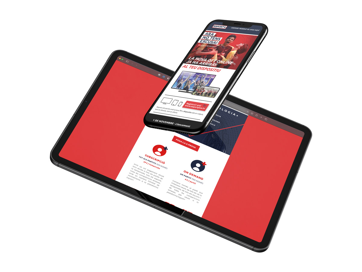
It is the ideal communication channel for loyalty and conversion. It is directed towards the subscribed audience; it is highly exclusive. The messages sent contain important information (such as the schedule) and content of interest to readers, with the aim of turning them into Esport+ subscribers. Therefore, we have the means to reach an interested audience, create customized messages, manage the received data, and contact individuals one by one.
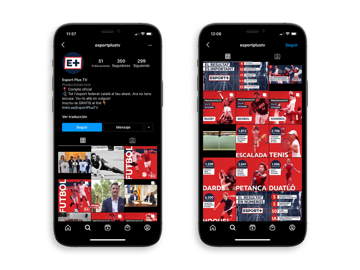
SOCIAL MEDIA
It's the complete opposite of the previous message: when we talk about networks (Instagram, Facebook, Twitter, YouTube...), we are referring to locations with high traffic; we are communicating to the masses. We take this into account when developing actions on networks, playing with concepts and mainly highlighting 4 key messages: the sports that are part of it, the increase in viewership during broadcasts, the collaboration agreements achieved, and the scheduled programming for each sport during that week. This last point is essential: we have found that sharing the schedule increases the number of views the game receives; there is a direct correlation.